Color Psychology
Color can induce moods and dictate powerful sensations. Since some centuries back, as early as the 15th century, the artists in the quest of expressing their emotions while looking to provoke their audience’s, used different pigments in their artworks. Notwithstanding, it wasn’t until the 18th century that a compendious and extensive color theory (which are the rules for the use of colors in arts) was introduced, with Isaac Newton’s color wheel.
With the arrival of Goethe, sometime later, a theory that explained the color linked to human emotional experienced was presented.
Until the mid-17th century, scientists believed that colors were a combination of light and dark. They experimented by projecting sunlight onto a surface through a prism and claimed that the crystals colored the white light from the sun, resulting in some of the colors of the rainbow.
It was Isaac Newton who, in 1665, confirmed that what the prism did was to separate the colors that make up white light rather than to color it. He did this by refracting the light onto a surface at a much greater distance.
In 1666, Newton created a circular scheme with the 7 colors of the rainbow: red, orange, yellow, green, green, blue, indigo and violet. This color wheel, which is still in use today, demonstrates that white light is composed of these colors because, when the wheel is spun at high speed, the human eye perceives white.
Newton explained the physical aspect of color, but he did not investigate the psychological aspect: how do colors make us feel? What is the relationship between colors and emotions?
Goethe, the German poet, approached the study of colors from the point of view of perception in 1810. In this way he was able to establish a relationship between colors and the following moods: lucid, serious, melancholic, powerful and serene.
Professor Max Lüscher (1927), head of the Institute for Psychomedical Diagnosis in Lucerne, developed a system for determining psychological aspects according to the colors chosen by the patient.
General description of color psychology.
Color psychology is defined as the “study of shades as a determinant of human behavior”. In short: artists take in consideration how the combination of colors in an artwork will make their public feel. They can even stimulate certain feelings and thoughts.
To see this more clearly, we will use Picasso’s Blue and Pink Period as an example.
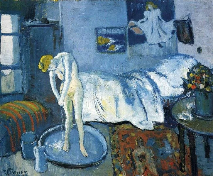
In the “Blue Period”, he did numbing works, showing scenes denuded of any hope. Later, in the “Pink Period”, he used cheerful tones such as red, orange and pink. Thus, you can see the direct contrast with the cold colors of his earlier period.
The beginning of the blue period had its origin in the suicide of a great friend of Picasso’s, Carles Casagemas, in 1901. This experience brought to flower a sensibility that he had not yet brought to light. He experienced a conflict between life and death, something he had not yet experienced in his own flesh: he felt Casagemas’ death almost as if it were his own. This led him to express himself in ways he had never known before.
The use of the color blue in most of his works during this period is due to this sadness with which he was filled.
During the blue period, Picasso lived in austerity, due to the lack of sales of his works. In 1902 he settled in Barcelona, very close to Las Ramblas, but months later he returned to Paris. In January 1903 he returned to Barcelona, where he stayed until April 1904. It was a period of instability for the painter, who was mired in poverty and depression.
This was one of the first works of the blue period. This room was the one the artist had in Paris, which, curiously enough, he shared with, among others, his late friend Casagemas.
This work is a faithful portrait of Picasso’s blue period, where sadness is the protagonist. The guitarist expresses a profound sadness and decadence: extremely thin features, with very thin legs and arms. His clothes are torn, as if he were a beggar. And the head is completely bent, with a neck that lacks strength, barely holding the head in place. All painted in shades of blue.
Notice how the meaning of color played an important role in his works. He translated his feelings into an image that the viewer could unpack. The public was given a glimpse into the mind of Picasso.
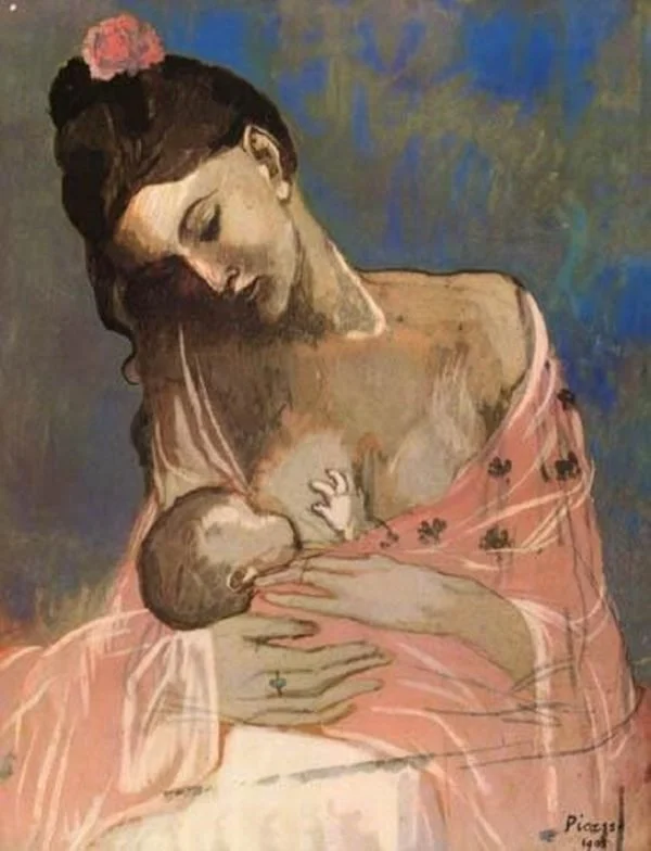
The pink period (1904 to 1907). During this period Picasso lived with numerous actors and street artists in Paris. There was a great circus atmosphere, as the neighborhood was located near a circus, so it was easy to find minstrels, harlequins, acrobats, acrobats and clowns, as well as comedians, painters, comedians, artists, actors, poets and writers. This atmosphere influenced the fact that Picasso left his colder period, where everything was blue, melancholic and sad.
He was characterized by a palette of soft, pastel colors. In addition to the colors, Picasso changed the marginal characters of his blue period for other marginal characters: the artists of the Medrano circus in Montmartre. These performers are no longer desperate like the anguished blue characters, but neither do they exude the “joy” they usually display on stage in front of the public. We see them pensive, melancholic, dreamy. We feel them very “human”.
Picasso liked the agility and bravery of circus performers, so he dedicated many paintings to them: he painted masks, harlequins, tamers and clowns; the painting entitled Family of acrobats with a monkey (1905) is a perfect example of the pink period. Note the tenderness and affection shown by the characters towards the child.
The science of color in Western culture
Although even today there is debate about the fallibility of associating colors with very specific emotions, there are unquestionable reactions that colors can produce in us human beings. The study of color in relation to emotion has many different aspects. It has biological, cultural, psychological, social and even marketing connotations.
Some examples:
Green.
Green is even more closely linked to nature than blue. Plants and trees provide a wide variety of shades of green. In fact, since it is the color of so many plants, which we humans are “designed” to recognize, it is one of the colors we perceive in the greatest number of shades. Most cultures see green as a sign of youth and health. It is also associated with prosperity and life.
Red
A bright, abrasive red color can express anger and turmoil. However, red signifies more than just frustration or chaos. It conveys passion, including love. Red is used by many commercial brands not necessarily because of the feelings it evokes, but because it is so easy for the human eye to notice. There is an old saying among painters: “if you want to sell a painting, paint it red”.
Yellow
In Western cultures, yellow is identified as cheerful and warm because of its relationship to the sun. However, when used too harshly or in the wrong context, it can cause frustration and discomfort. Yellow is also associated with appetite stimulation.


